Oppro.
Resource sharing platform for disconnected youth in the US
SOCIAL ENTREPRENEURSHIP · PRODUCT DESIGN
OVERVIEW
An app that provides opportunity youth within Alameda County (California) access to available opportunities and resources within their community.
Organizations share resources, opportunities, and documents securely from the web app to students. Students and youth manage their important resources, opportunities, and documents securely on their phones.

MY ROLE
Product Design
Brand Design
TIMELINE
Oct 2021 - May 2022
THE TEAM
1 Product Designer (me)
1 Software Engineer
3 Marketing Managers
TOOLS
Figma, Adobe Creative Suite, Miro, Zoom
How might we ...
provide opportunity youth access to available opportunities and resources within their community?
FINAL DESIGN
Intuitive and user-friendly app
At this stage of the app, my main project goals were to simplify the app, make it more intuitive for the user, as well as improve the visual appearance of the entire interface.
The most important part was to design an overall friendlier UI for the 16-24 age group, so I mimicked the design on Instagram.
Hold up - How did we get here? Let's revisit the process ...
Click to jump to section


.png)

01
WHO ARE OPPORTUNITY YOUTH?
Youth seeking better opportunities and outcomes
OPPORTUNITY YOUTH = DISCONNECTED YOUTH
Opportunity youth are individuals between the ages of 16 and 24 who are neither in school nor working. Many of these youth have disabilities, are homeless, or are involved with the juvenile justice or child welfare systems.

Youth aged between 16 - 24

Out of work and eeking employment opportunites and/or skills

Out of school and seeking to enroll in a program (diploma, GED, certificate)

Disconnected from schools and/or services they maight qualify for
"Young adults who are not in school or working represent untapped potential for our nation. They cost taxpayers $93 billion annually and $1.6 trillion over their lifetimes in lost revenues and increased social services."
PROBLEM STATEMENT
Getting disconnected youth connected
Opportunity youth are struggling to manage the documents that education organizations need to support them and have difficulty applying for eligible opportunities and resources.
"I need help, but it is all about convenience for me. I have a lot going on. I want to know what is in it for me and also be able to apply quickly."
- Jennifer, 18
12.5 %
of 16- to 24-year olds in the US are not currently enrolled in school or employed.
$1.6T
is paid by taxpayers over their lifetimes in lost revenues and increased social services.
9 million
The number of opportunity youth in the US doubled in 2020 due to the COVID-19 crisis.
Competitive analysis
To better understand competitors' business models, I analyzed the 3 most popular apps addressing opportunity sharing for students and youth.
FINDINGS
I found that almost none of them had this aspect of a two-way-based communication with a case manager. Additionally, none of them included an analytics tool, which I found later was crucial for any NGO for fundraising and justifying its money use.

COMPETITVE ADVANTAGE
I then conducted a competitive audit in 3 different youth-serving apps, based on the features that our interviews showed were important to the user.

02
DEFINE
The Opportunity Youth Persona
Click through the slider to see each persona!

How does the platform work?
Oppro empowers organizations to provide the resources and opportunities to students in an automated and secure way.
Youth & students

An app where students can find and manage their job opportunities, training, and documents securely on their phone.
Community organisations

Organisations can share resources, opportunities, and documents securely to students via text.
03
REDESIGN OF THE APP
1. Make feed experience more personalized and useful
One of the main changes I had to make based on user interviews was the overall look and feel of the app.

2. Redesigning the onboarding experience
Some students sturggled with understandign the app, so an imporved onboardign experience was crucial.

3. Create a way to quickly access their footprint
In this step I focused on createing a profile for the user, so they can track their progress and have all the opportunities saves in one place.

04
MEASURING IMPACT
How can we measure the social impact of Oppro?
I conducted customer interviews with our first customer of the app's beta launch and figured out that a big part of Oppro's chance of success was to figure out how we could track the social impact of the app.
INTERVIEW QUESTIONS I ASKED THE ORGANISATIONS USING OPPRO:
1. What challenges did you face before introducing Oppro?
2. What words would you use to describe Oppro?
3. What challenges do you face while using Oppro?
4. What is in your opinion the most valuable feature of the app?
5. How would you measure the success of Oppro?
5. What feature would you wish for if you had a magic wand?

Analysing the interviews in Miro
The insight from the inverviews with organisations
I conducted customer interviews with our first customer of the app's beta launch and figured out that a big part of Oppro's chance of success was to figure out how we could track the social impact of the app.
Theme 1: Access to students
Students and youth are not checking and answering their emails, so the ability to communicate with them through text would be a big benefit. Information is everywhere and teachers need the fastest and easiest way to get it to students.
Theme 2: Measuring impact
The ability to track the conversion of students and their success rate of completing an opportunity would increase the value of Oppro significantly.
Thus, we asked ...
How might we collect data from on opportunites the students have completed to track impact and receive feedback?
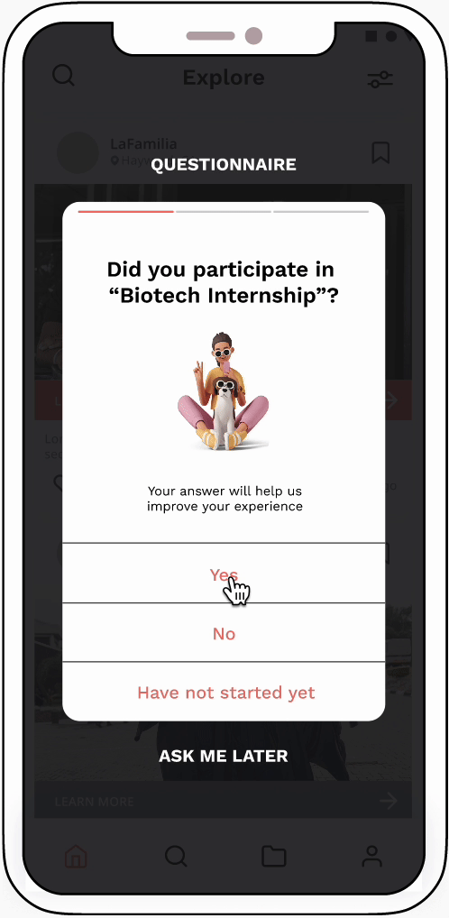
NEW FEATURE
Adding a pop up questionnarie
This was the quickest feature we could implement to receive feedback from the students on their successful or unsuccessful completion of new opportunities.
If I could do it again, I would explore different options for gathering feedback from students.
The text obstructs the entire screen’s view, which can be frustrating for a user. Furthermore, users are likely to quickly dismiss it without reading the text.
What I’d do differently next time.
Be insight- not process-driven. My first version of this case study was full of unnecessary text at this stage instead of tying everything into the bigger question- “so how does this fit into the bigger picture”? Hence, I cut down the copy by more than 60% and focused on the major points of my project.
You didn’t fail, you just found 100 ways that didn’t work. From noticing mistakes in my UI to uncovering more foundational UX problems in my app, I’m thankful to have constantly asked for feedback from my peers and my mentor.